Qualidad · Freelance · 2020 · Mini case
Qualidad: a printing company that finally looks the part
A new website for a large-format printing company. From personas and a competitor benchmark to a full visual system, it's one of my favorite UI projects.
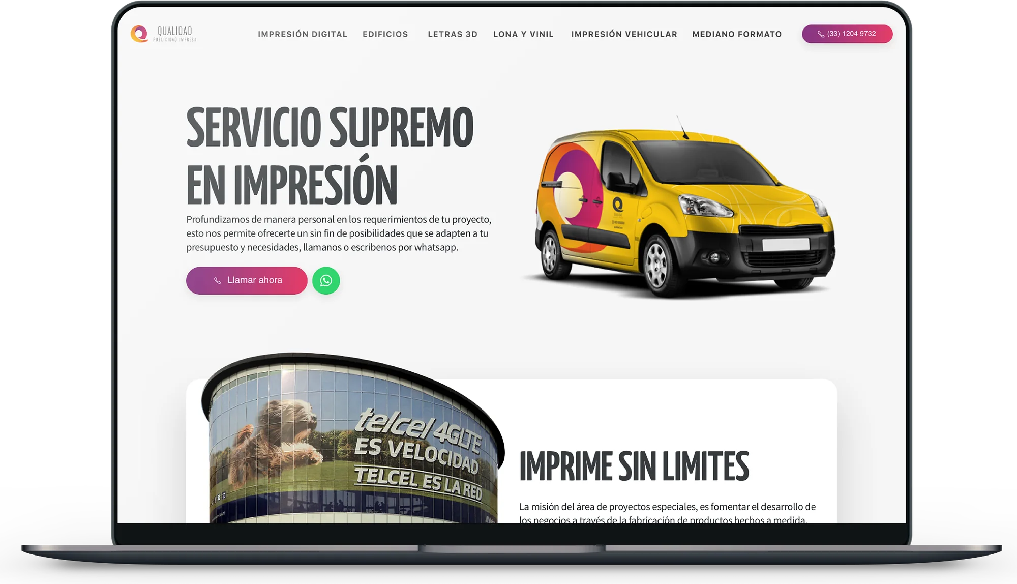
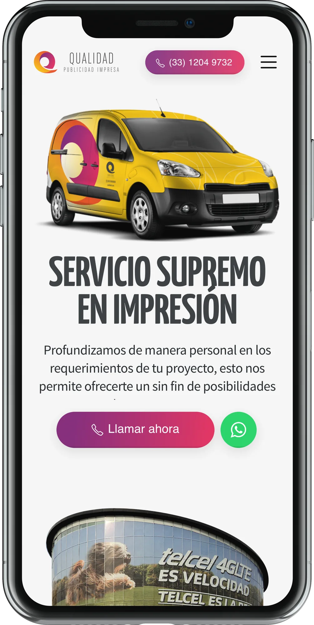
Qualidad prints big: banners, signs, illuminated 3D letters and all kinds of advertising. Their work was great, but their website didn’t show it. We wanted a site that persuades people to call, write on WhatsApp or leave their number, and that shows clearly why Qualidad is worth it.
Understanding the clients
We started with two personas: advertisers and designers, who need quality prints at a price that lets them make a profit, and decision makers in companies, who need a supplier they can trust with their projects.
Then a heuristic review of the old site (using Nielsen’s ten principles) and a quick benchmark of five local competitors, from how they show up on Google to what each one does well and badly.
Structure first
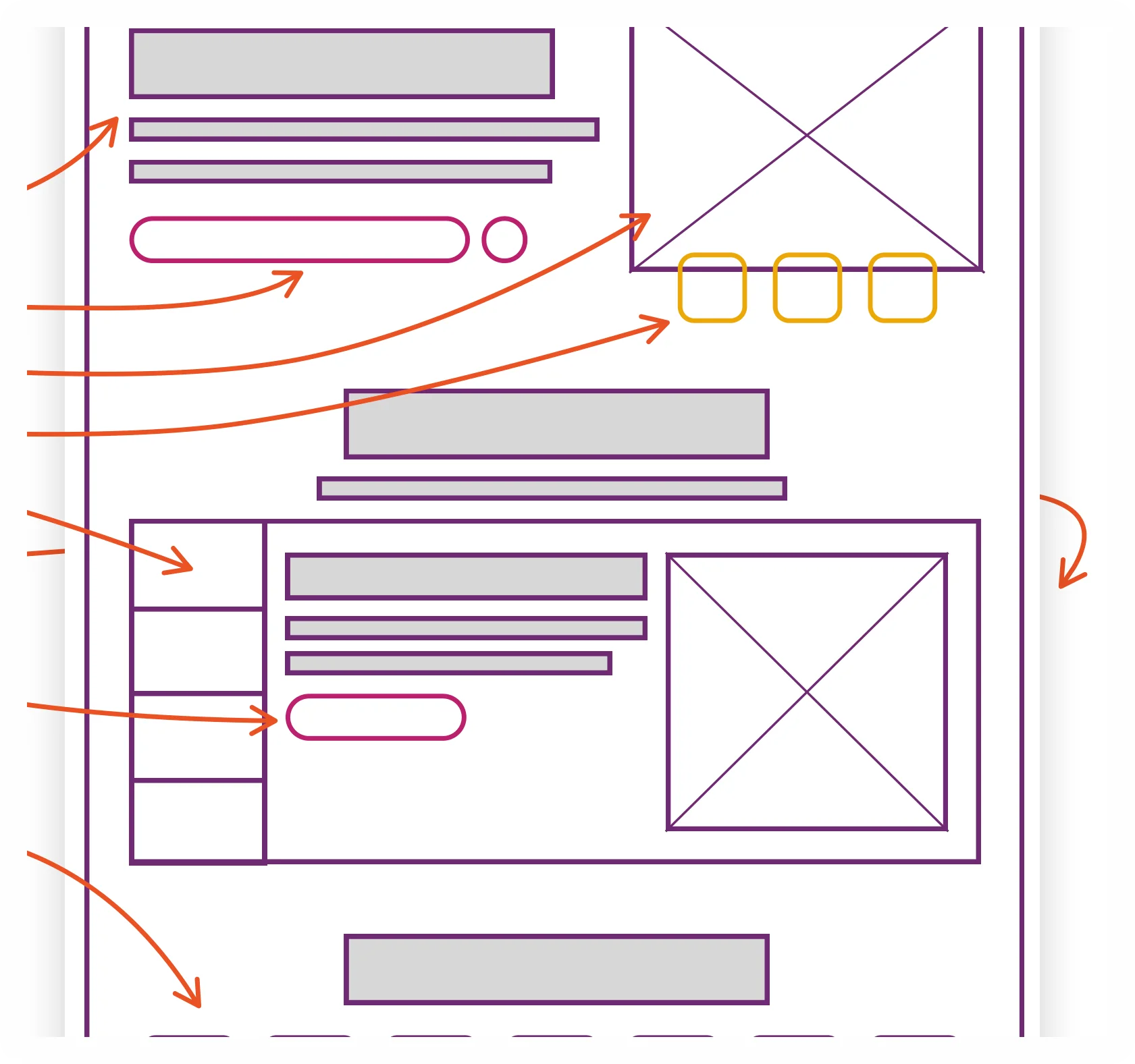
With that, we drew the information architecture and the wireframes for the landing page and the product pages: a clear value offer, a call to action to talk by phone, trust badges, a gallery of real work and the frequent questions people ask.
A visual system
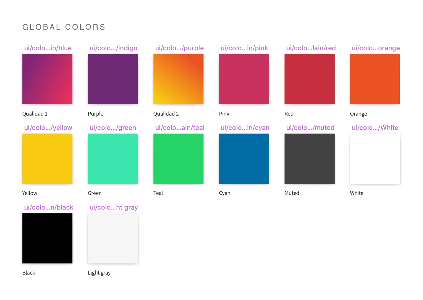
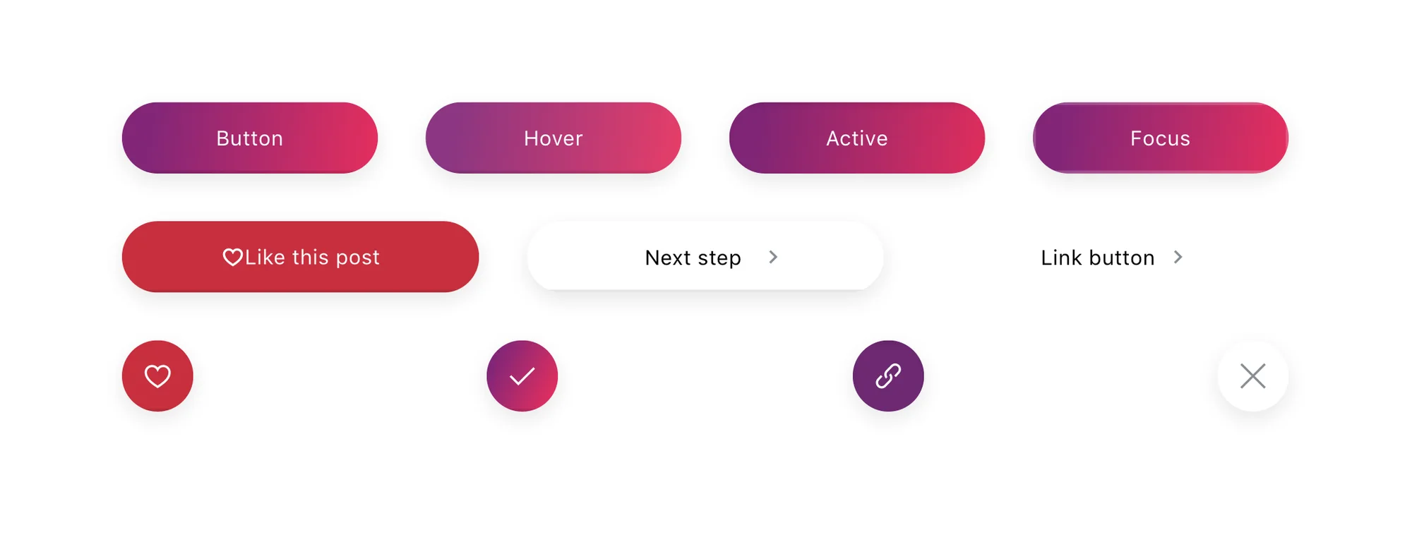
We explored three style directions (clean with 3D elements, friendly flat illustration, and vibrant color with photography) and built the system around the brand: colors for layouts, states and interactions, a Bootstrap grid, breakpoints based on the most used screen sizes of their visitors, Yanone Kaffeesatz for the brand voice and Source Sans Pro for reading.
The result
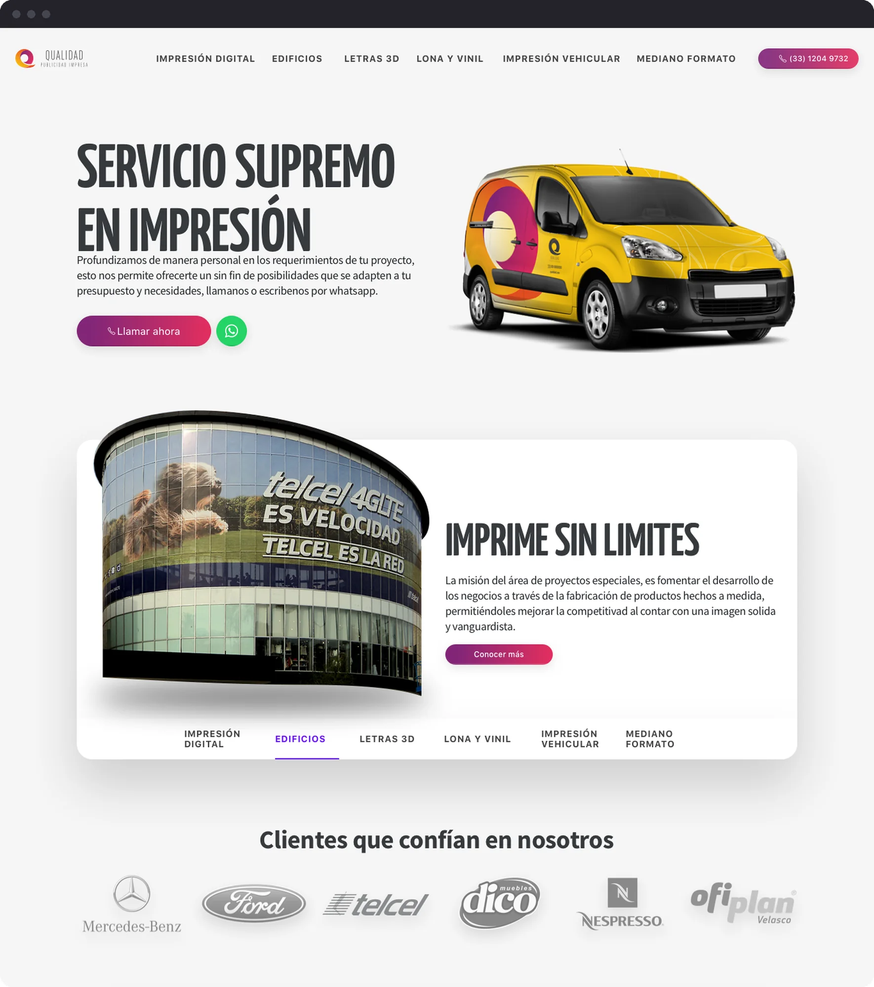
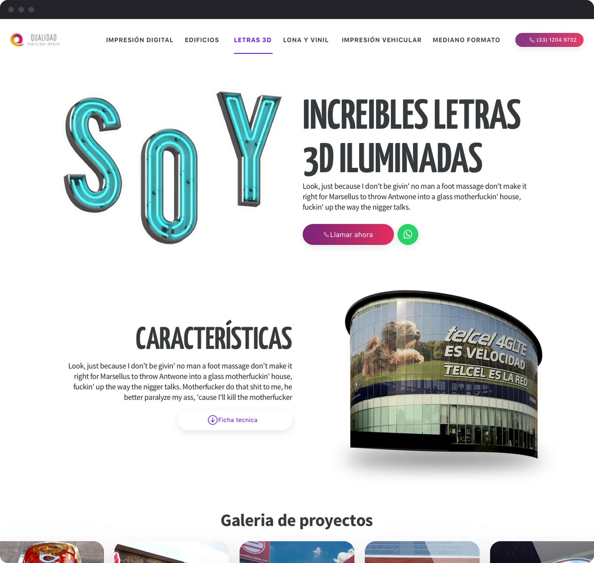
We took Qualidad’s identity to an aesthetic level it had never reached before, and honestly, it’s still one of the UI projects I enjoyed the most.