Bitvavo · 2026 · Case study
A gift that can't wait to be opened
A small animation that tells people there's something new for them in the Campaign Hub, without getting in their way. I researched it, animated it in Rive and coded it into the app.
The problem
The gift icon opens the Campaign Hub, where people find promotions that can make the app more rewarding. We wanted it to feel more alive and to catch people’s attention when there’s something new, but nobody likes being interrupted while checking their portfolio. How do you say “there’s something for you” in a friendly way?
Looking for the right emotion
I started with a benchmark. I looked at how video games animate surprise boxes and loot chests, how other apps move small elements, and how we all picture a gift box in our heads. I was looking for an emotion more than a movement. Many of the animations I found also had things I wanted to do better, mostly how natural the motion felt.
The answer was a few small jumps. A jumping box creates anticipation, like something inside wants to come out.
The animation
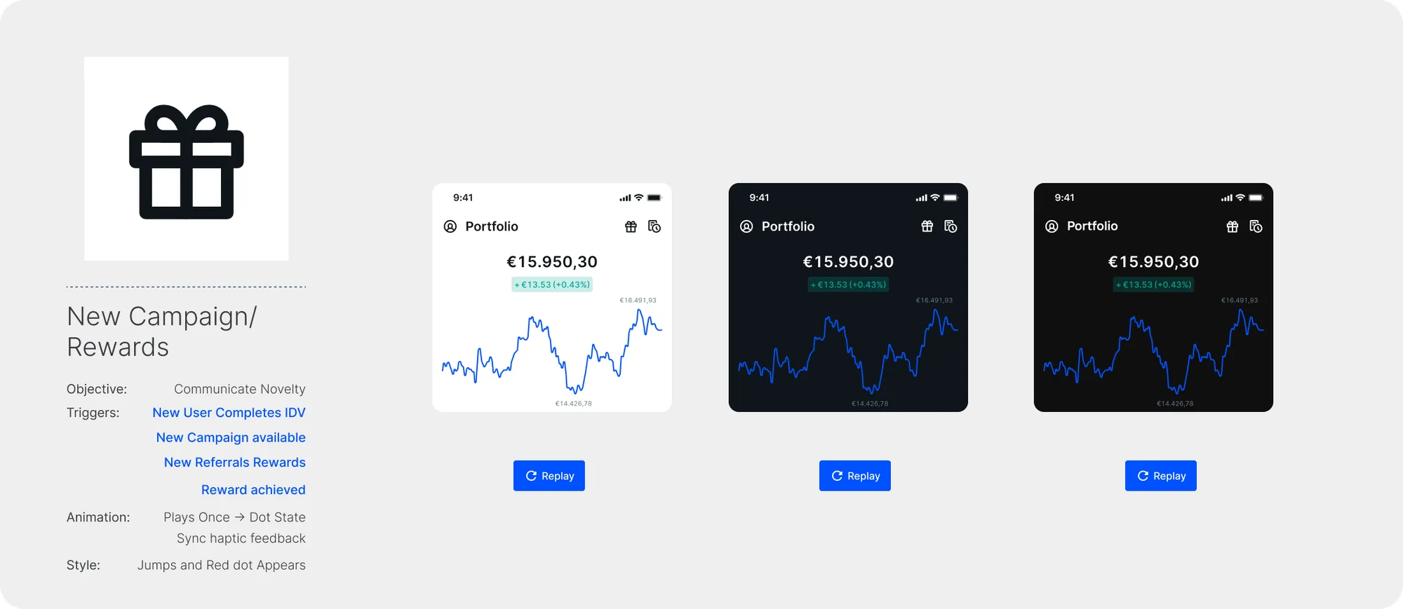
The icon appears after the app finishes its opening animations. When a new campaign arrives, the box starts to jump, opens a little, a few sparkles come out (we wanted to add a bit of joy here) and a red dot appears to tell you there’s something you haven’t seen. When you open it, the dot disappears until there’s something new worth your attention.
I used Disney’s principles of animation so the box feels like it has weight: it squashes and stretches with gravity and each bounce, and the bow reacts to every jump.
It plays once and then stays in the dot state, with haptic feedback in sync. Four moments trigger it: a new user completes their identity verification, a new campaign is available, there are new referral rewards, or a reward is achieved.
Built with the design system
The most important part: I connected the animation to the app’s color tokens. The same Rive file works in dark, light and Pro themes, and the icon changes color with the theme.
From design to code
I did the research, the design and the animation in Rive, with some great advice from a teammate who is an animation expert to make the motion smoother. Then I took it to the React Native app with Cursor. Rive uses its own names for colors, so I mapped them to our semantic tokens, giving React a table that tells it exactly which color goes where. I also guided Cursor through the logic: when to jump, when to open, when to show the dot and when to reset.
What we ran into
The new Rive libraries need a newer app architecture, and updating the architecture of a whole app is heavy work. That’s where my frontend teammates took over the project. As soon as they finish the update, the icon can be released.