Santander México · via PALO IT · 2018-20 · Case study
Making car insurance easy to compare and buy
Three years with the Autocompara team, redesigning Santander's car insurance comparison site from the journey to the copy. Digital sales more than doubled.
Context
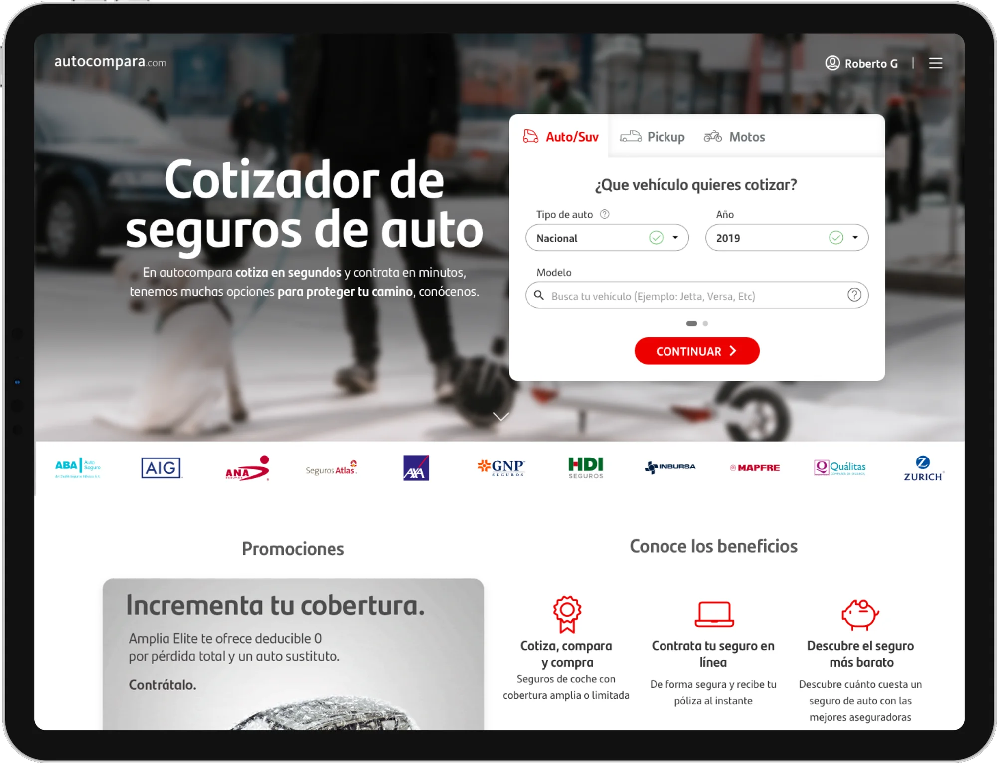
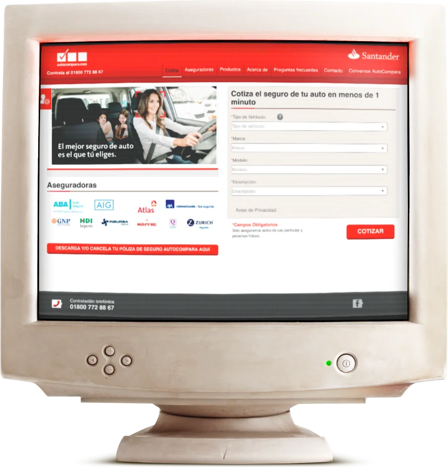
Autocompara is Santander México’s car insurance comparison site, where you can compare and buy a policy from the main insurers in the country (AXA, GNP, Qualitas, Zurich, Mapfre and more). When we arrived, sales had been flat for four years and new comparison sites were showing up, so Santander asked PALO IT for help. I ended up working with the Autocompara team for more than three years, and without a doubt it’s one of the products I love the most.
Understanding the journey
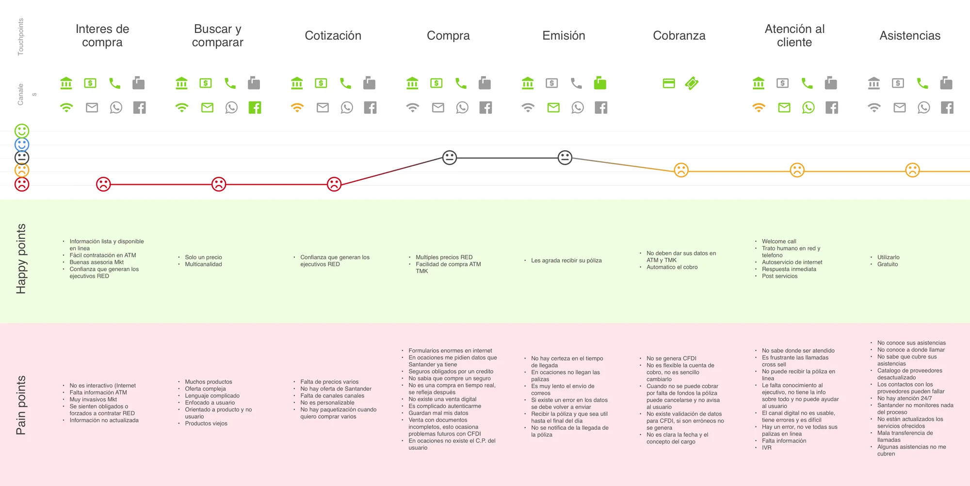
We started by listening. In workshops with the people who talk to customers every day, we mapped the whole journey: every touchpoint, how people felt, where they got stuck and what made them happy.
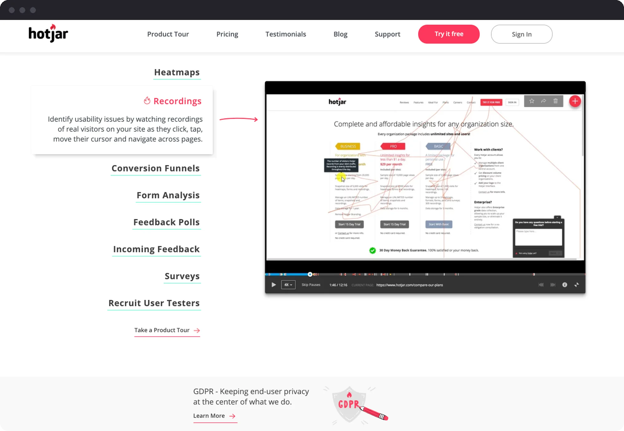
Then we added the tools to see what was really happening: Hotjar and Google Analytics to understand behavior in the funnel, and one-click satisfaction surveys by email so customers could tell us more in their own words.
What we changed
A faster flow. Better technology, lighter images and fewer steps took the time to get a quote from 36 to 28 seconds.
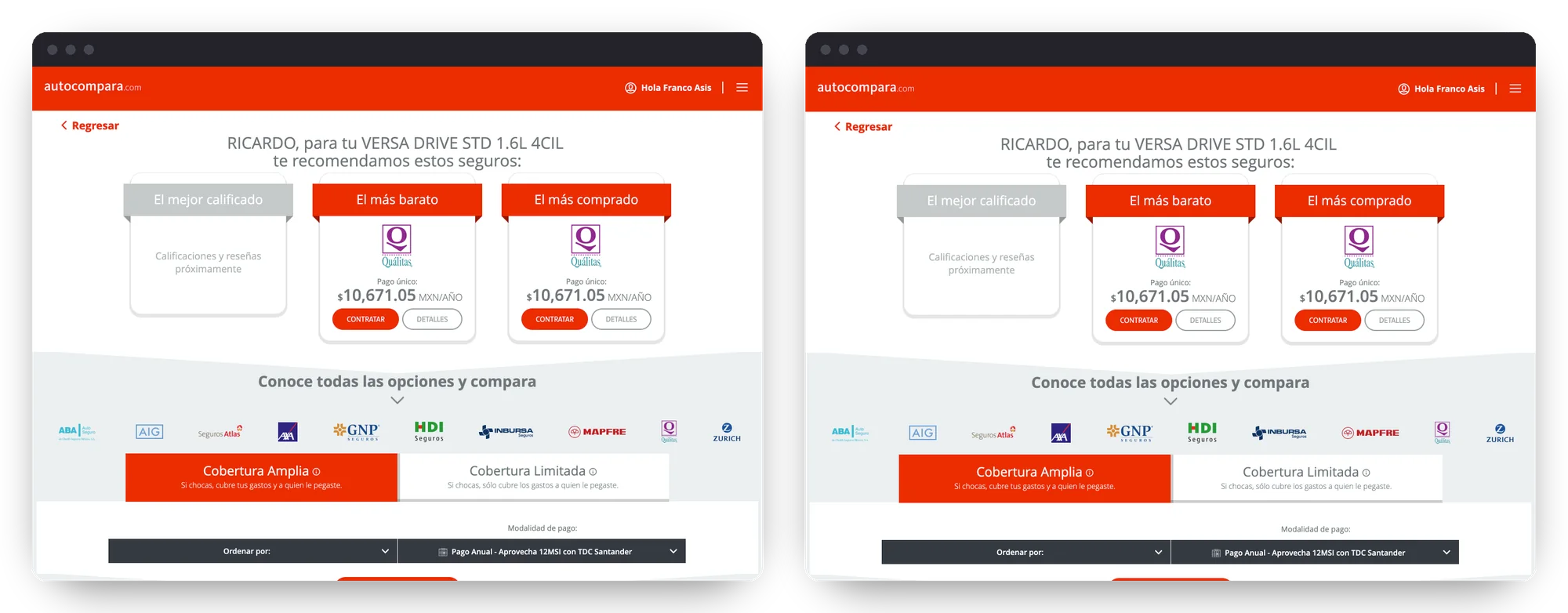
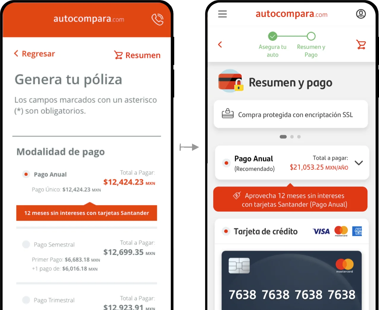
A new brand and a new design system. Autocompara was the first Santander product to launch the 2018 brand identity. We used the moment to improve contrast, readability and the feedback people get while filling a form.
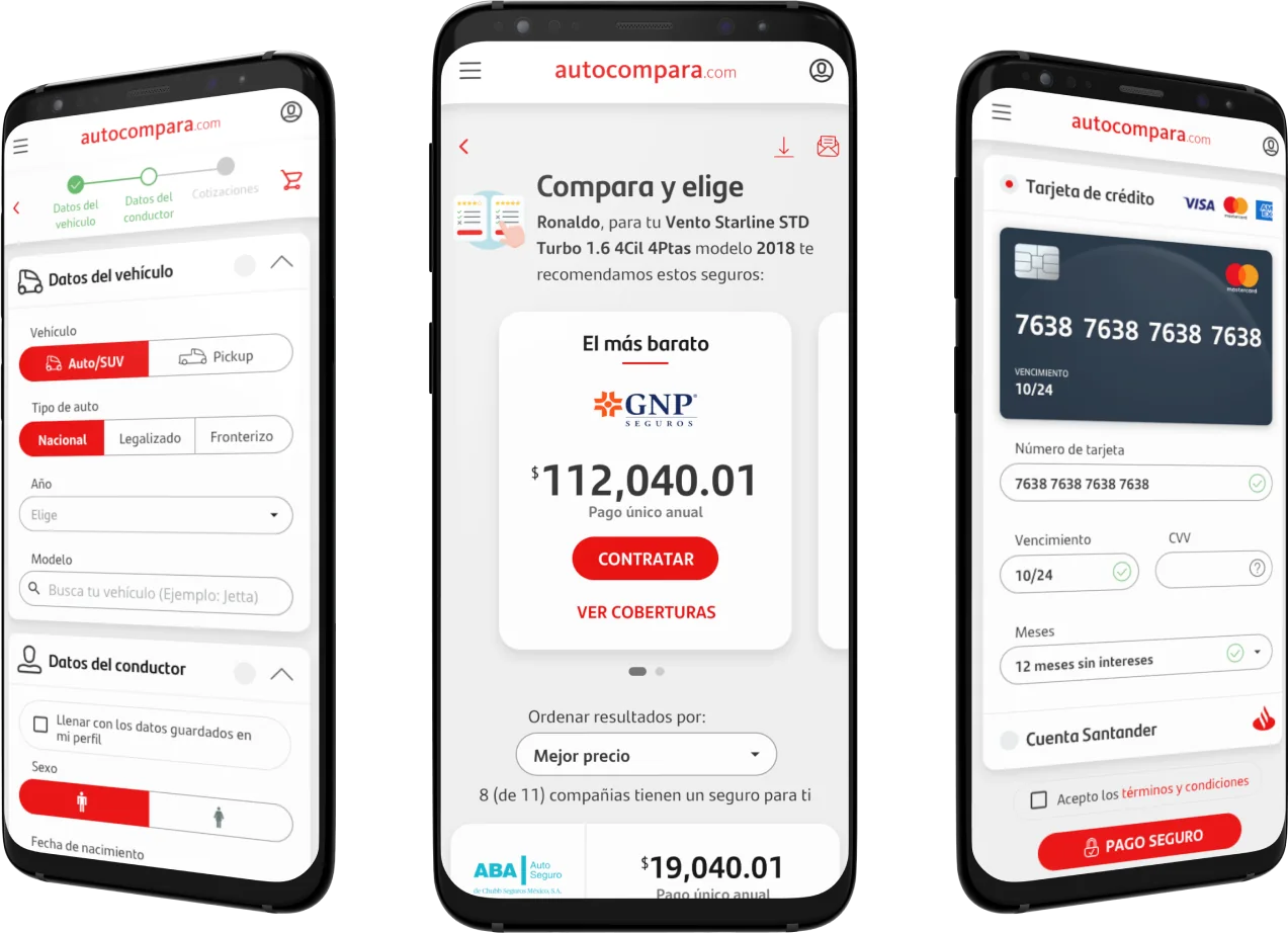
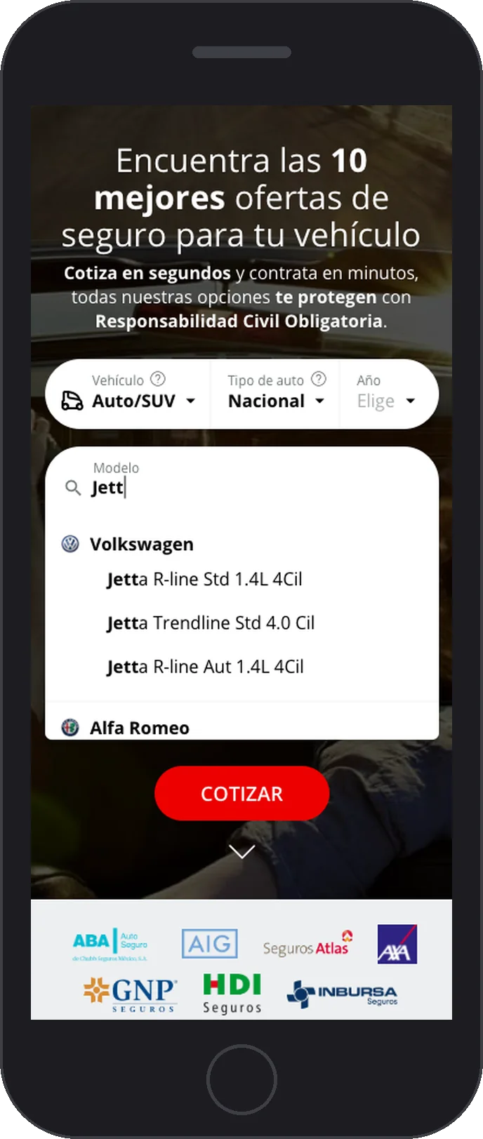
Shorter forms. We renamed confusing fields, added helpful tooltips, used APIs to fill some inputs automatically and rebuilt the car model search, which also remembers your last searches.
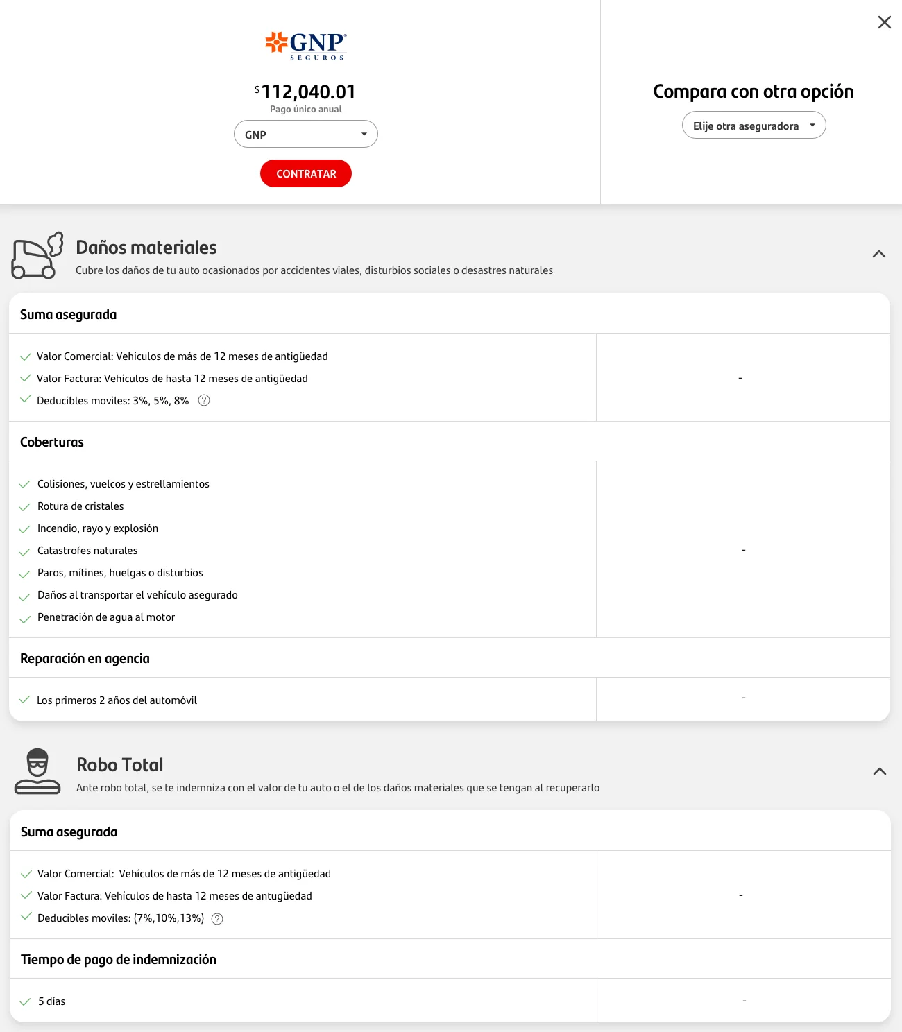
The secret sauce: the words. This was a huge amount of work. Every insurer hides the important details of a policy inside long legal documents, so we went through the terms and conditions of each company, one by one, and rewrote what really matters in plain, human language. If you can’t see those details, you can’t really compare.
Results
Sales had barely moved for years. From 2018, when our team started, they grew every year, and by 2020 digital sales were more than double the year before we arrived. Autocompara also became the favorite tool of branch advisors, and in 2020 the bank asked our team to take care of all of Santander’s other digital insurance products.
Recognition
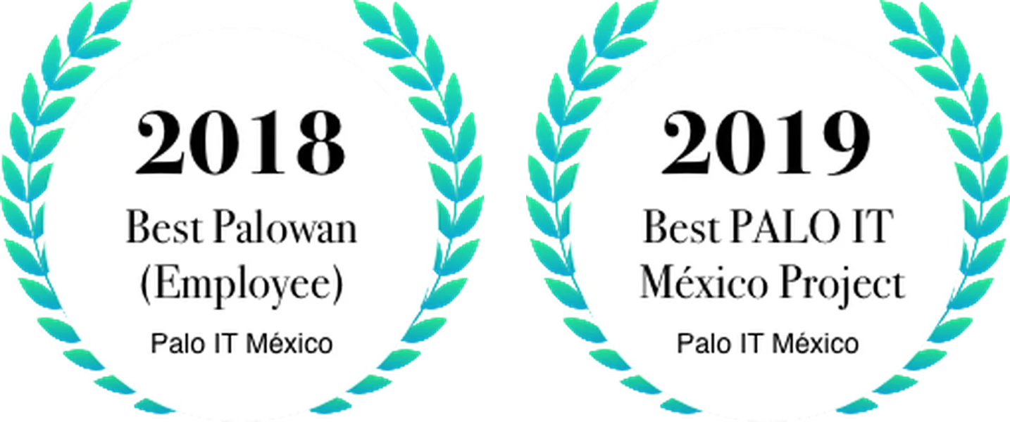
- Best PALO IT México Project, 2019, for Autocompara.
- Best Palowan (employee of the year at PALO IT), 2018.
I’m still very proud of what this team built.