BBVA México · 2021 · Case study
Making pet insurance clear enough to buy
People wanted to protect their pets, but the coverages were hard to understand. We made them clear, and sales followed.
Context
Dogs and cats live in more than half of Mexican homes (57%), and BBVA had a pet insurance product with a lot of potential. Even so, sales were below expectations, and similar products were disappearing from the market. We had a few weeks to show a result, so we worked inside the existing design system and built on research from earlier experiments.
The problem
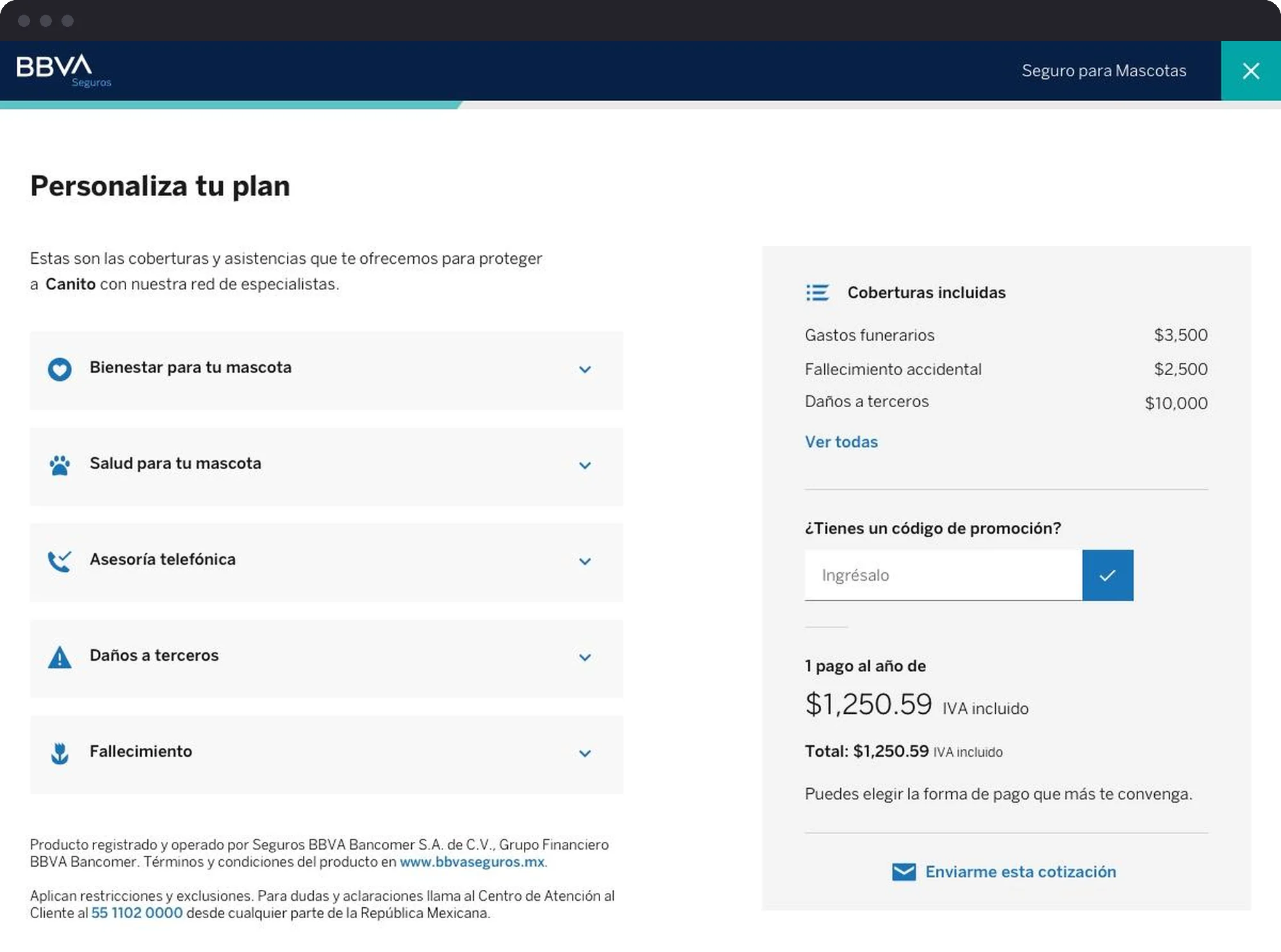
The funnel converted only 2.8%, and the biggest drop came at step 3, where people explore the coverages: 84% of people left there, and only 16-18% moved forward. That screen is where people decide if the product is worth it, so it mattered a lot.
A heuristic review showed three issues:
- Coverage information was split across two places on the screen.
- The useful details only appeared if you went looking for them.
- Almost every coverage said “Included”, so the optional ones were impossible to spot.
On mobile it was even harder: no conditions, no number of events, no idea where you could use each service.
Who buys, and why
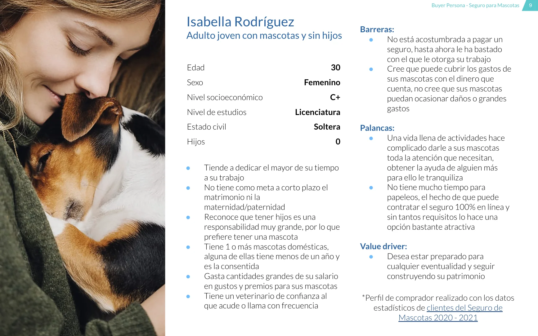
We looked at who had bought in the last months and built a buyer persona: a young adult around 30, with pets and no kids, used to doing everything online, and not really convinced she needs insurance. Customer service data told us which services people actually use, with pet salon and vaccines at the top.
Then the post-purchase survey gave us the surprise of the project. Clarity of information mattered almost as much as protection, and more than price:
Behavioral design
Our goal was to lift step progression by at least 6% and sales by at least 4%, without hurting the sales that were already coming in. We designed a variant that:
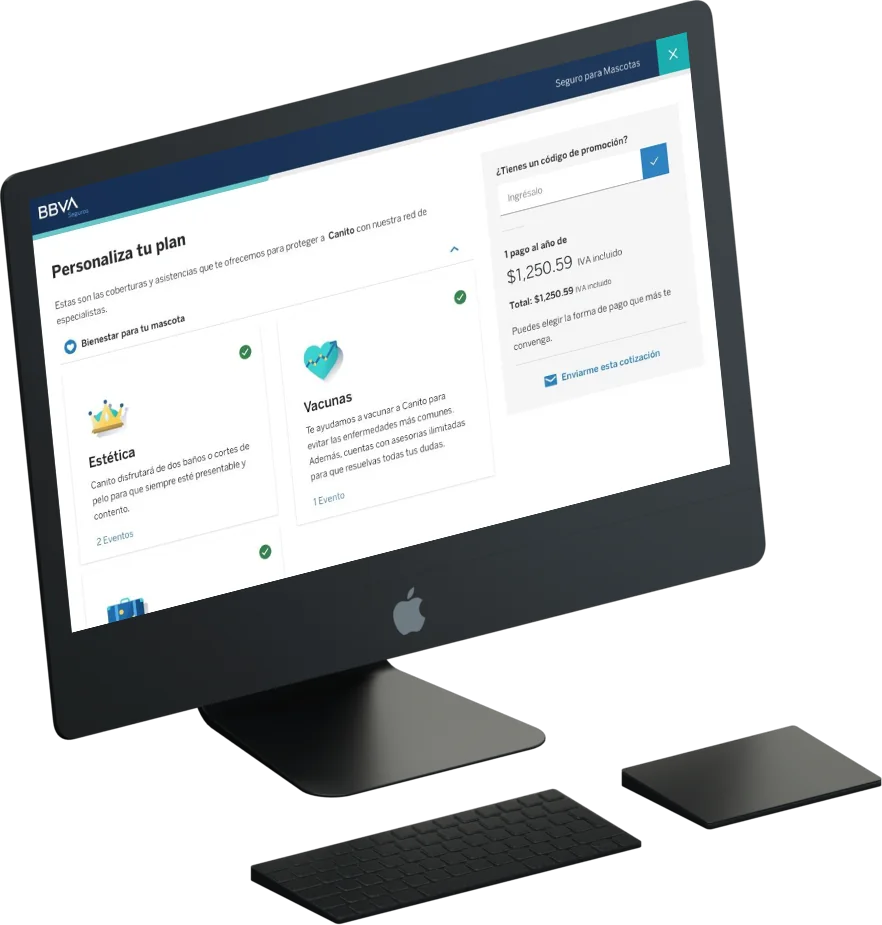
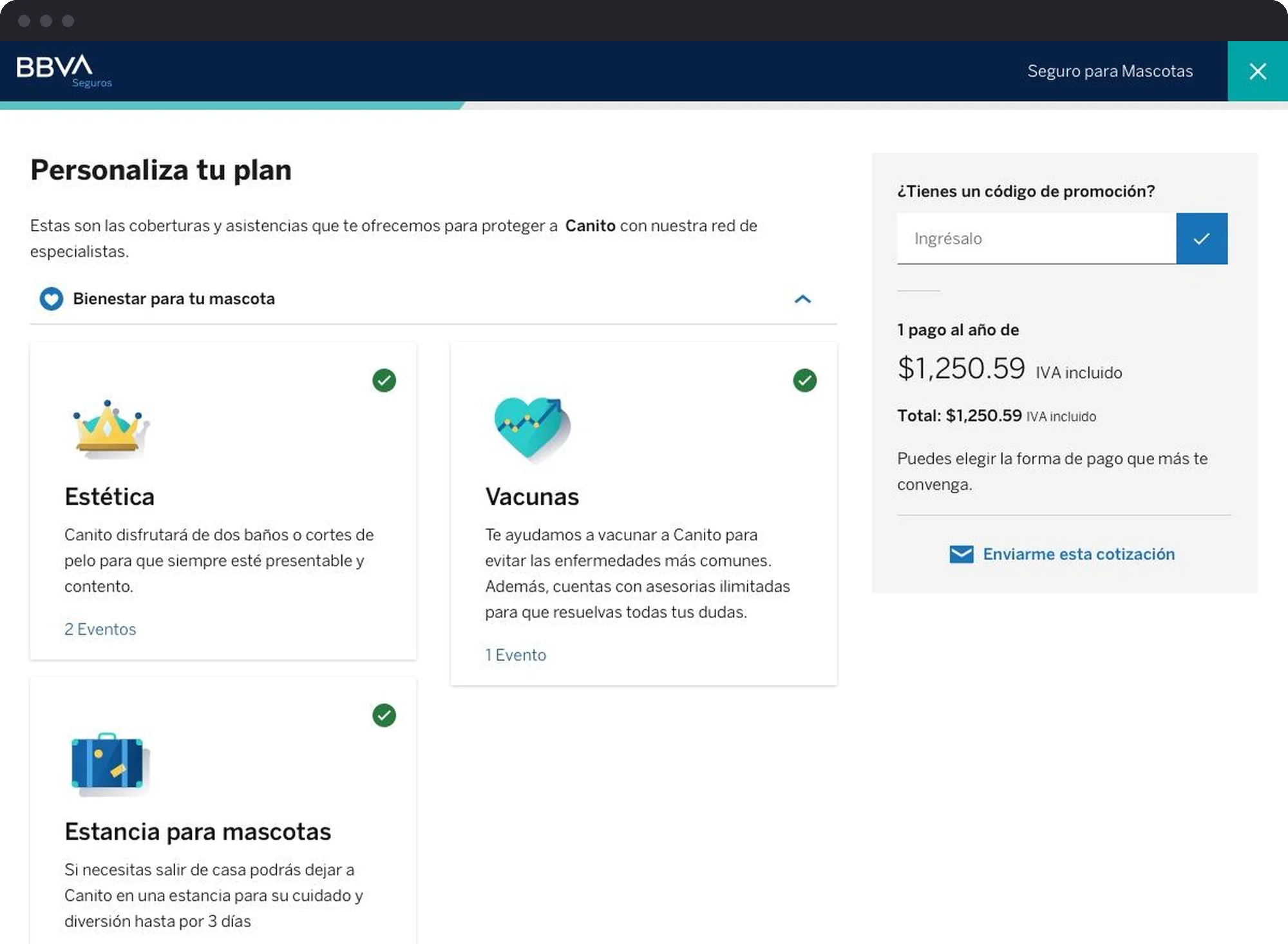
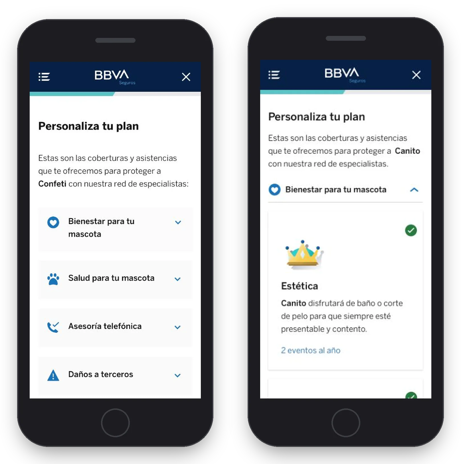
- Shows the three most used coverages first, so the value is the first thing you see: wellbeing, vaccines and pet boarding.
- Explains that these things are a normal part of having a pet, to answer the “this won’t happen to my pet” feeling, using overconfidence bias, projection bias and the availability heuristic with care.
- Speaks in “when” instead of “if”, because accidents and checkups do happen.
- Talks about your pet by name, like “We will help you vaccinate Canito to prevent the most common illnesses.”
- Gives every coverage an illustration and a short, honest explanation.
Testing
We ran an A/B test in Adobe Target, showing the new version to half of our users for 28 days or until we reached 95% statistical confidence.
Results
On desktop, more people moved forward (17.8% to 21.1%) and many more bought. On mobile, fewer people moved forward (18.2% to 15.7%), but conversion still grew 61%: the people who continued knew exactly what they were buying.
Version B went live right away, and the jump in sales opened the door to bring the same ideas to other BBVA insurance funnels.
What I took from it
Learnings
- 01
Clarity sells.
People ranked clear information above price. Explaining the product well did more than any discount could.
- 02
Fewer clicks forward is not always bad news.
On mobile, fewer people continued, but the ones who did were ready to buy. Looking at the whole funnel told the real story.
- 03
People on mobile don’t mind scrolling. They mind boring scrolling.
The new version was longer, yet people spent more time on the step and converted more. Scrolling is fine when there’s something interesting and easy to scan along the way.
The next idea on our list was an interactive map of the places where you can use each service.